Windowed Skinning Tutorial
Introduction:
Zoom Player uses a fully customizable skin scripting engine to allow you to design your own media playback experience. The scripting is quite straight-forward, especially if you have even a little programming or other scripting experiences (e.g. HTML).
The basic premise behind a Zoom Player skin is to create one or more bitmap containing all of the skin's graphical elements and then using the script language, instruct Zoom Player on how to combine the graphical element into a fully functioning user interface.
Unlike some media players, Zoom Player's interface can be resized dynamically. As such, some of the graphical elements are required to be dynamic in order to look good. This means that when the user interface window is resized, some of the graphical elements are tiled to maintain fluidity.
This Tutorial always reflects the latest beta version. Skins are mostly backward compatible, but it is recommended using the latest beta when scripting new skins.
Fullscreen Navigation interface skins
The fullscreen navigation interface has its own independent set of skins, to learn how to tweak an existing design or create your own, visit the Fullscreen Navigation Skinning Tutorial.
A Word about Tinting
Several skin functions take RGB values (similar to HTML script). Zoom Player supports skin-tinting (modification of the skin color through the skin selection interface).
If you want an RGB color not to be tinted, specify "NT" right after the value (no space), for example:
FillRect(6,21,64,128,FFFFFFNT)
Graphical Elements
Here is an example of how a skin's graphical elements look like:
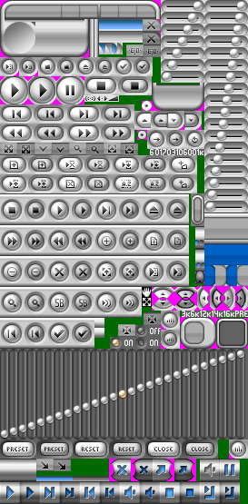
As you can see, the actual locations of elements within the bitmap is irrelevant as we later instruct Zoom Player where in the bitmap each element is located. The elements include the skin background graphics, buttons in both the up, down, hover and activate state (for some of the buttons), volume and time line controls.
Dynamic Variables:
Zoom Player contains a number of dynamic variables which can be used within the skin to display dynamic content (such as the current time, duration of current clip, etc...). Some elements may have become obsolete as the technology evolved and are marked as such.
| Description | |
| Main Interface Window Width in Pixels | |
| Main Interface Window Height in Pixels | |
| Main Interface Window Width in Pixels divided by 2 (useful for screen-centering) | |
| Main Interface Window Height in Pixels divided by 2 (useful for screen-centering) | |
| Playlist Interface Window Width in Pixels | |
| Playlist Interface Window Height in Pixels | |
| Playlist Interface Window Width in Pixels divided by 2 (useful for screen-centering) | |
| Playlist Interface Window Height in Pixels divided by 2 (useful for screen-centering) | |
| Width in Pixels of Video Area | |
| Height in Pixels of Video Area | |
| Source Video Width in Pixels | |
| Source Video Height in Pixels | |
| Width in Pixels of Video Area with Aspect Ratio Adjustment | |
| Height in Pixels of Video Area with Aspect Ratio Adjustment | |
| Name of Currently loaded file (full path) | |
| Path of Currently loaded file | |
| Name of Currently loaded file (file name+extension) | |
| Name of Currently loaded file (file name only, no extension or path) | |
| Width in Pixels of the Control Bar after deducting the space used by the buttons and Right Margin | |
| Width in Pixels of the entire Control Bar | |
| Height in Pixels of the Control Bar | |
| Width in Pixels of the Control Bar after deducting the space used by the buttons divided by 2 | |
| Height in Pixels of Control Bar divided by 2 | |
| (Obsolete) Overlay Color RGB (can be used for transparency with the Control Bar) | |
| Text displayed in the current timeline | |
| Current Time Display (playing media) | |
| Time Remaining | |
| Total Duration of playing content | |
| Long Current Time Display (playing media) (always show HH:MM:SS, even if HH = 0) | |
| Long Time Remaining (always show HH:MM:SS, even if HH = 0) | |
| Long Total Duration of playing content (always show HH:MM:SS, even if HH = 0) | |
| The current volume level | |
| Current DVD Chapter | |
| Current DVD Title | |
| Current DVD Volume Label | |
| Currently playing item in the playlist | |
| Number of items in the current playlist, returns "[n] file(s)" where [n] is the number of files | |
| Number of items in the current playlist, returns only the number | |
| Total Time used by currently loaded Playlist Items. | |
| Playlist time based current position based on the time of the entire playlist. | |
| The Current Time (Clock) | |
| The Current Date | |
| The current video zooming used in the window interface (affected by the Alt-"1..5" keys and the new "exZoomTo" function) | |
| TAG (ID3/APE/OGM/WMA) Containing the Track/Title Name | |
| TAG (ID3/APE/OGM/WMA) Containing the Genre | |
| TAG (ID3/APE/OGM/WMA) Containing the Track Number | |
| TAG (ID3/APE/OGM/WMA) Containing the Language | |
| TAG (ID3/APE/OGM/WMA) Containing the Artist Name | |
| TAG (ID3/APE/OGM/WMA) Containing the Album Name | |
| TAG (ID3/APE/OGM/WMA) Containing the Year | |
| TAG (ID3/APE/OGM/WMA) Containing the Author Name | |
| TAG (ID3/APE/OGM/WMA) Containing the Encoder | |
| TAG (ID3/APE/OGM/WMA) Containing a Comment | |
| TAG (ID3/APE/OGM/WMA) Containing a URL | |
| TAG (ID3/APE/OGM/WMA) Containing the Copyright Notice |
Constants
Constants are fixed skin parameters that are given initially at the creation of the skin. For example:
iMinWidth = (320)
Some elements may have become obsolete as the technology evolved and are marked as such.
| Constant Name | Description |
| Determines which Skin Groups are active by Default (see below for more information on skin groups) | |
| Specifies if the Skin only contains audio (see defaultaudio.skn), value can be 1 for Audio Only and 0 for regular. | |
| Name of non-compressed BMP or Compressed PNG (8bit/24bit) image that contains all the skin graphics | |
| BMP/PNG image used for Playlist Skinning elements (if doesn't exists, "SkinFileName" is used) | |
| BMP/PNG image used for Equalizer Skinning elements (if doesn't exists, "SkinFileName" is used) | |
| BMP/PNG image used for OSD Skinning elements (if doesn't exists, "SkinFileName" is used) | |
| BMP/PNG image used for drawing the control bar (if doesn't exists, "SkinFileName" is used) | |
| BMP/PNG image used for right-click Context Menu elements (if doesn't exists, "SkinFileName" is used) | |
| BMP/PNG image used for drawing Custom Windows/Dialogs with Alpha-blended Buttons | |
| Temporarily load (while the skin is used) a font which isn't installed on the system | |
| Name of a Cursor file that will be used for timeline seeking | |
| Initial Window Width | |
| Initial Window Height | |
| Initial Video Width | |
| Initial Video Height | |
| Initial Video Position in pixels from left position of Window | |
| Initial Video Position in pixels from top position of Window | |
| Minimum Video Width (It's recommended keep the minimum Width/Height to a 4:3 aspect ratio) | |
| Minimum Video Height | |
| (Obsolete, replaced by "RateExData") Left Position of Rate bar witin window | |
| (Obsolete, replaced by "RateExData") Top Position of Rate bar witin window | |
| TimeLine Width | |
| TimeLine Height | |
| TimeLine position in pixels from left position of Window | |
| TimeLine position in pixels from top position of Window | |
| TimeLine Color (Hex RGB Value, like on web pages. Not required if a bitmap is set using TimeLineFG) | |
| TimeLine Font Size (don't use, replaced by tLineFontHeight) | |
| TimeLine Font Height | |
| TimeLine Font Y-Offset in pixels (can be negative value) | |
| TimeLine Font Name | |
| TimeLine Font Color | |
| Bold and Italic, example : tLineFontStyle = (Bold|Italic), To disable style use (None) as value. | |
| Don't show any text on timeline (Set to 1 to show no text and 0 to show text - default) | |
| Hex RGB Value of the coor used for Transparency on the Timeline | |
| Control Bar Font Size (don't use, replaced by cBarFontHeight) | |
| Control Bar Font Height | |
| Control Bar Font Y-Offset in pixels (can be negative value) | |
| Control Bar Font Name | |
| Control Bar Font Color | |
| Bold and Italic, example : CBarFontStyle = (Bold|Italic), To disable style use (None) as value. | |
| Don't show any text on the control bar timeline (Set to 1 to show no text and 0 to show text - default) | |
| Control Bar Button Width (must be set before any buttons are added to the control bar) | |
| Control Bar Button Height (same as width, but also sets the height of the control bar) | |
| Number of pixels to save on the right side of skin | |
| Control Bar TimeLine Color (Not required if a bitmap is set using TimeLineCBarFG) | |
| Minimum allowed Control Bar time line width | |
| Width of the Control Bar time line | |
| Height of the Control Bar time line | |
| Control Bar TimeLine position in pixels from left position of Control Bar | |
| Control Bar TimeLine position in pixels from top position of Control Bar | |
| Hex RGB Value of the coor used for Transparency on the Control Bar Timeline | |
| Hex RGB Value of the color used for Window Transparency on the Main User Interface | |
| Hex RGB Value of the color used for Window Transparency on the Control Bar | |
| Hex RGB Value of the color used for Window Transparency on the Playlist | |
| Hex RGB Value of the color used for Window Transparency on the Equaliser |
Skinning Functions
The skin script functions are used to construct the skin's appearance.
FillRect(DestX, DestY, Width, Height, RGBColor)
| ||||||||||||||||||||||||||||||||||||||||||||||||||||||||||||||||||||||||||||||||||||||||||||||||||||||||||||||||||||||||||||||||||||||||||||||||||||||||||||||||||||||||||||||||||||||||||||||||||||||||||||||||||||||||||||||||||||
FillMask(SrcX, SrcY, Width, Height, DestX, DestY, SrcRGBColor, DestRGBColor)
| ||||||||||||||||||||||||||||||||||||||||||||||||||||||||||||||||||||||||||||||||||||||||||||||||||||||||||||||||||||||||||||||||||||||||||||||||||||||||||||||||||||||||||||||||||||||||||||||||||||||||||||||||||||||||||||||||||||
CopyBitmap(SrcX, SrcY, Width, Height, DestX, DestY)
| ||||||||||||||||||||||||||||||||||||||||||||||||||||||||||||||||||||||||||||||||||||||||||||||||||||||||||||||||||||||||||||||||||||||||||||||||||||||||||||||||||||||||||||||||||||||||||||||||||||||||||||||||||||||||||||||||||||
CopyStretchedBitmap(SrcX, SrcY, SrcWidth, SrcHeight, DestX, DestY, DestWidth, DestHeight)
| ||||||||||||||||||||||||||||||||||||||||||||||||||||||||||||||||||||||||||||||||||||||||||||||||||||||||||||||||||||||||||||||||||||||||||||||||||||||||||||||||||||||||||||||||||||||||||||||||||||||||||||||||||||||||||||||||||||
CopyTransBitmap(SrcX, SrcY, Width, Height, DestX, DestY, RGBColor)
| ||||||||||||||||||||||||||||||||||||||||||||||||||||||||||||||||||||||||||||||||||||||||||||||||||||||||||||||||||||||||||||||||||||||||||||||||||||||||||||||||||||||||||||||||||||||||||||||||||||||||||||||||||||||||||||||||||||
CopyMaskedBitmap(SrcX, SrcY, Width, Height, DestX, DestY)
| ||||||||||||||||||||||||||||||||||||||||||||||||||||||||||||||||||||||||||||||||||||||||||||||||||||||||||||||||||||||||||||||||||||||||||||||||||||||||||||||||||||||||||||||||||||||||||||||||||||||||||||||||||||||||||||||||||||
TileBitmapV(SrcX, SrcY, Width, Height, DestX, DestY, FillHeight)
| ||||||||||||||||||||||||||||||||||||||||||||||||||||||||||||||||||||||||||||||||||||||||||||||||||||||||||||||||||||||||||||||||||||||||||||||||||||||||||||||||||||||||||||||||||||||||||||||||||||||||||||||||||||||||||||||||||||
TileBitmapH(SrcX, SrcY, Width, Height, DestX, DestY, FillWidth)
| ||||||||||||||||||||||||||||||||||||||||||||||||||||||||||||||||||||||||||||||||||||||||||||||||||||||||||||||||||||||||||||||||||||||||||||||||||||||||||||||||||||||||||||||||||||||||||||||||||||||||||||||||||||||||||||||||||||
TileBitmapA(SrcX, SrcY, Width, Height, DestX, DestY, FillWidth, FillHeight)
| ||||||||||||||||||||||||||||||||||||||||||||||||||||||||||||||||||||||||||||||||||||||||||||||||||||||||||||||||||||||||||||||||||||||||||||||||||||||||||||||||||||||||||||||||||||||||||||||||||||||||||||||||||||||||||||||||||||
GradientRectH(DestX, DestY, Width, Height, RGBColor1, RGBColor2)
| ||||||||||||||||||||||||||||||||||||||||||||||||||||||||||||||||||||||||||||||||||||||||||||||||||||||||||||||||||||||||||||||||||||||||||||||||||||||||||||||||||||||||||||||||||||||||||||||||||||||||||||||||||||||||||||||||||||
GradientRectV(DestX, DestY, Width, Height, RGBColor1, RGBColor2)
| ||||||||||||||||||||||||||||||||||||||||||||||||||||||||||||||||||||||||||||||||||||||||||||||||||||||||||||||||||||||||||||||||||||||||||||||||||||||||||||||||||||||||||||||||||||||||||||||||||||||||||||||||||||||||||||||||||||
TimeLineBG(SrcX, SrcY, Width)
| ||||||||||||||||||||||||||||||||||||||||||||||||||||||||||||||||||||||||||||||||||||||||||||||||||||||||||||||||||||||||||||||||||||||||||||||||||||||||||||||||||||||||||||||||||||||||||||||||||||||||||||||||||||||||||||||||||||
TimeLineFG(SrcX, SrcY, Width)
| ||||||||||||||||||||||||||||||||||||||||||||||||||||||||||||||||||||||||||||||||||||||||||||||||||||||||||||||||||||||||||||||||||||||||||||||||||||||||||||||||||||||||||||||||||||||||||||||||||||||||||||||||||||||||||||||||||||
TimeLineHighlight(StartX=Value, StartY=Value, StartW=Value, StartH=Value, MiddleX=Value, MiddleY=Value, MiddleW=Value, MiddleH=Value, EndX=Value, EndY=Value,EndW=Value,EndH=Value,YOfs=Value)
| ||||||||||||||||||||||||||||||||||||||||||||||||||||||||||||||||||||||||||||||||||||||||||||||||||||||||||||||||||||||||||||||||||||||||||||||||||||||||||||||||||||||||||||||||||||||||||||||||||||||||||||||||||||||||||||||||||||
TimeLineChapters
| ||||||||||||||||||||||||||||||||||||||||||||||||||||||||||||||||||||||||||||||||||||||||||||||||||||||||||||||||||||||||||||||||||||||||||||||||||||||||||||||||||||||||||||||||||||||||||||||||||||||||||||||||||||||||||||||||||||
TimeLineFontShade(Left, Right, Top, Bottom)
| ||||||||||||||||||||||||||||||||||||||||||||||||||||||||||||||||||||||||||||||||||||||||||||||||||||||||||||||||||||||||||||||||||||||||||||||||||||||||||||||||||||||||||||||||||||||||||||||||||||||||||||||||||||||||||||||||||||
TimeLineActive(SrcX, SrcY, Width, Height, XOffset, YOffset)
| ||||||||||||||||||||||||||||||||||||||||||||||||||||||||||||||||||||||||||||||||||||||||||||||||||||||||||||||||||||||||||||||||||||||||||||||||||||||||||||||||||||||||||||||||||||||||||||||||||||||||||||||||||||||||||||||||||||
TimeLineStart(SrcX, SrcY, Width)
| ||||||||||||||||||||||||||||||||||||||||||||||||||||||||||||||||||||||||||||||||||||||||||||||||||||||||||||||||||||||||||||||||||||||||||||||||||||||||||||||||||||||||||||||||||||||||||||||||||||||||||||||||||||||||||||||||||||
TimeLineEnd(SrcX, SrcY, Width)
| ||||||||||||||||||||||||||||||||||||||||||||||||||||||||||||||||||||||||||||||||||||||||||||||||||||||||||||||||||||||||||||||||||||||||||||||||||||||||||||||||||||||||||||||||||||||||||||||||||||||||||||||||||||||||||||||||||||
PlayListData(DestX=Value, DestY=Value, Width=Value, Height=Value, MinWidth=Value, MinHeight=Value,
Border=RGBValue,Background=RGBValue,BackgroundGrad=RGBValue, Foreground=RGBValue, SelectBG=RGBValue,
SelectFG=RGBValue, Highlight=RGBValue, ScrollBG=RGBValue, ScrollBGGrad=RGBValue, ScrollFace=RGBValue,
ScrollDark=RGBValue, ScrollLight=RGBValue, BGSrcX=Value, BGSrcY=Value, BGSrcW=Value, BGSrcH=Value,
ScrollWidth=Value, ScrollBGX=Value, ScrollBGY=Value, ScrollBGW=Value, ScrollBGH=Value, ScrollFGX=Value,
ScrollFGY=Value, ScrollFGW=Value, ScrollFGH=Value, SearchXOfs=Value)
| ||||||||||||||||||||||||||||||||||||||||||||||||||||||||||||||||||||||||||||||||||||||||||||||||||||||||||||||||||||||||||||||||||||||||||||||||||||||||||||||||||||||||||||||||||||||||||||||||||||||||||||||||||||||||||||||||||||
MenuData(params)
| ||||||||||||||||||||||||||||||||||||||||||||||||||||||||||||||||||||||||||||||||||||||||||||||||||||||||||||||||||||||||||||||||||||||||||||||||||||||||||||||||||||||||||||||||||||||||||||||||||||||||||||||||||||||||||||||||||||
CWData(TransColor=RGBValue, yMargin=Value, HdrFontYOfs=Value, HdrFontHeight, HdrFontColor, TextXMargin, BHeight=Value, BLeftWidth=Value, BMidWidth=Value, BRightWidth=Value, BLeftUSrcX=Value, BLeftUSrcY=Value, BLeftDSrcX=Value, BLeftDSrcY=Value, BMidUSrcX=Value, BMidUSrcY=Value, BMidDSrcX=Value, BMidDSrcY=Value, BRightUSrcX=Value, BRightUSrcY=Value, BRightDSrcX=Value, BRightDSrcY=Value, BFontMargin=Value)
| ||||||||||||||||||||||||||||||||||||||||||||||||||||||||||||||||||||||||||||||||||||||||||||||||||||||||||||||||||||||||||||||||||||||||||||||||||||||||||||||||||||||||||||||||||||||||||||||||||||||||||||||||||||||||||||||||||||
SkinModes(Mode1=Type|Value, Mode2=Type|Value, Mode3=Type|Value, Mode4=Type|Value, Mode5=Type|Value, Mode6=Type|Value)
| ||||||||||||||||||||||||||||||||||||||||||||||||||||||||||||||||||||||||||||||||||||||||||||||||||||||||||||||||||||||||||||||||||||||||||||||||||||||||||||||||||||||||||||||||||||||||||||||||||||||||||||||||||||||||||||||||||||
VolumeWindow(SrcX=Value, SrcY=Value, Width=Value, Height=Value, VSrcX=Value, VSrcY=Value, VWidth=Value, VHeight=Value, VDestX=Value, VDestY=Value, Images=Value, Vertical=True/False, TransColor=Value, XOfs=Value, YOfs=Value, Hint=Value)
| ||||||||||||||||||||||||||||||||||||||||||||||||||||||||||||||||||||||||||||||||||||||||||||||||||||||||||||||||||||||||||||||||||||||||||||||||||||||||||||||||||||||||||||||||||||||||||||||||||||||||||||||||||||||||||||||||||||
VolumeExData(SrcX=Value, SrcY=Value, DestX=Value, DestY=Value, Width=Value, Height=Value, Images=Value, Vertical=True/False, Hint=Value)
| ||||||||||||||||||||||||||||||||||||||||||||||||||||||||||||||||||||||||||||||||||||||||||||||||||||||||||||||||||||||||||||||||||||||||||||||||||||||||||||||||||||||||||||||||||||||||||||||||||||||||||||||||||||||||||||||||||||
RateExData(SrcX=Value, SrcY=Value, DestX=Value, DestY=Value, Width=Value, Height=Value, Images=Value, Vertical=True/False, Hint=Value)
| ||||||||||||||||||||||||||||||||||||||||||||||||||||||||||||||||||||||||||||||||||||||||||||||||||||||||||||||||||||||||||||||||||||||||||||||||||||||||||||||||||||||||||||||||||||||||||||||||||||||||||||||||||||||||||||||||||||
BalanceExData(SrcX=Value, SrcY=Value, DestX=Value, DestY=Value, Width=Value, Height=Value, Images=Value, Vertical=True/False, Hint=Value)
| ||||||||||||||||||||||||||||||||||||||||||||||||||||||||||||||||||||||||||||||||||||||||||||||||||||||||||||||||||||||||||||||||||||||||||||||||||||||||||||||||||||||||||||||||||||||||||||||||||||||||||||||||||||||||||||||||||||
ResizeBox(XOfs, YOfs, Width, Height, CursorType)
| ||||||||||||||||||||||||||||||||||||||||||||||||||||||||||||||||||||||||||||||||||||||||||||||||||||||||||||||||||||||||||||||||||||||||||||||||||||||||||||||||||||||||||||||||||||||||||||||||||||||||||||||||||||||||||||||||||||
FolderImage(XOfs, YOfs, Width, Height)
| ||||||||||||||||||||||||||||||||||||||||||||||||||||||||||||||||||||||||||||||||||||||||||||||||||||||||||||||||||||||||||||||||||||||||||||||||||||||||||||||||||||||||||||||||||||||||||||||||||||||||||||||||||||||||||||||||||||
(Obsolete) DrawText
| ||||||||||||||||||||||||||||||||||||||||||||||||||||||||||||||||||||||||||||||||||||||||||||||||||||||||||||||||||||||||||||||||||||||||||||||||||||||||||||||||||||||||||||||||||||||||||||||||||||||||||||||||||||||||||||||||||||
DrawExText(Type=Value, Target=Value, DestX=Value, DestY=Value, Width=Value, Height=Value, Align=Value, Case=Value,
WordWrap=Value, FontName=Value ,FontSize=Value, FontColor=Value, FontStyle=Value, Text=Value, Function=Value)
| ||||||||||||||||||||||||||||||||||||||||||||||||||||||||||||||||||||||||||||||||||||||||||||||||||||||||||||||||||||||||||||||||||||||||||||||||||||||||||||||||||||||||||||||||||||||||||||||||||||||||||||||||||||||||||||||||||||
(Obsolete) - CreateButton
| ||||||||||||||||||||||||||||||||||||||||||||||||||||||||||||||||||||||||||||||||||||||||||||||||||||||||||||||||||||||||||||||||||||||||||||||||||||||||||||||||||||||||||||||||||||||||||||||||||||||||||||||||||||||||||||||||||||
(Obsolete) - AddBarButton
| ||||||||||||||||||||||||||||||||||||||||||||||||||||||||||||||||||||||||||||||||||||||||||||||||||||||||||||||||||||||||||||||||||||||||||||||||||||||||||||||||||||||||||||||||||||||||||||||||||||||||||||||||||||||||||||||||||||
CreateExButton(Type=Value, Target=Value, SrcX=Value, SrcY=Value, Width=Value, Height=Value, HoverX=Value, HoverY=Value,
AlphaX=Value, AlphaY=Value, DestX=Value, DestY=Value, Function=Value, FunctionParam=Value,
StringParam=Value, TransColor=Value, Hint=Value, AniSpeed=Value)
| ||||||||||||||||||||||||||||||||||||||||||||||||||||||||||||||||||||||||||||||||||||||||||||||||||||||||||||||||||||||||||||||||||||||||||||||||||||||||||||||||||||||||||||||||||||||||||||||||||||||||||||||||||||||||||||||||||||
EQData(Width=Value, Height=Value, BarX=Value, BarY=Value, BarW=Value, BarC=Value,
BarPX=Value, BarPY=Value, Bar[n]X=Value, Bar[n]Y=Value)
| ||||||||||||||||||||||||||||||||||||||||||||||||||||||||||||||||||||||||||||||||||||||||||||||||||||||||||||||||||||||||||||||||||||||||||||||||||||||||||||||||||||||||||||||||||||||||||||||||||||||||||||||||||||||||||||||||||||
OSDPopUp(MinWidth=Value, MinHeight=Value, xMargin=Value, yMargin=Value, TransColor=RGBValue)
| ||||||||||||||||||||||||||||||||||||||||||||||||||||||||||||||||||||||||||||||||||||||||||||||||||||||||||||||||||||||||||||||||||||||||||||||||||||||||||||||||||||||||||||||||||||||||||||||||||||||||||||||||||||||||||||||||||||
ToggleInterface(Target=Value, Visible=Boolean)
| ||||||||||||||||||||||||||||||||||||||||||||||||||||||||||||||||||||||||||||||||||||||||||||||||||||||||||||||||||||||||||||||||||||||||||||||||||||||||||||||||||||||||||||||||||||||||||||||||||||||||||||||||||||||||||||||||||||
TintSource(SrcX=Value, SrcY=Value, Width=Value, Height=Value, rTint=Value, gTint=Value, bTint=Value, cIgnore=RGBValue)
| ||||||||||||||||||||||||||||||||||||||||||||||||||||||||||||||||||||||||||||||||||||||||||||||||||||||||||||||||||||||||||||||||||||||||||||||||||||||||||||||||||||||||||||||||||||||||||||||||||||||||||||||||||||||||||||||||||||
NoTintSource(Target=Value, SrcX=Value, SrcY=Value, Width=Value, Height=Value)
| ||||||||||||||||||||||||||||||||||||||||||||||||||||||||||||||||||||||||||||||||||||||||||||||||||||||||||||||||||||||||||||||||||||||||||||||||||||||||||||||||||||||||||||||||||||||||||||||||||||||||||||||||||||||||||||||||||||
Control Bar Skinning Functions
The following commands perform the exact function as the above, but apply to the Control Bar.
CopyCBarBitmap(SrcX, SrcY, Width, Height, DestX, DestY)
CopyCBarStretchedBitmap(SrcX, SrcY, SrcWidth, SrcHeight, DestX, DestY, SrcWidth, SrcHeight)
CopyCBarTransBitmap(SrcX, SrcY, Width, Height, DestX, DestY, RGBColor)
CopyCBarMaskedBitmap(SrcX, SrcY, Width, Height, DestX, DestY)
GradientCBarRectH(DestX, DestY, Width, Height, RGBColor1, RGBColor2)
GradientCBarRectV(DestX, DestY, Width, Height, RGBColor1, RGBColor2)
TileCBarBitmapV(SrcX, SrcY, Width, Height, DestX, DestY, FillHeight)
TileCBarBitmapH(SrcX, SrcY, Width, Height, DestX, DestY, FillWidth)
TileCBarBitmapA(SrcX, SrcY, Width, Height, DestX, DestY, FillWidth, FillHeight)
FillCBarRect(DestX, DestY, Width, Height, RGBColor)
TimeLineCBarBG(SrcX, SrcY, Width)
TimeLineCBarFG(SrcX, SrcY, Width)
TimeLineCBarHighlight(StartX=Value, StartY=Value, StartW=Value, StartH=Value, MiddleX=Value, MiddleY=Value, MiddleW=Value, MiddleH=Value, EndX=Value, EndY=Value,EndW=Value,EndH=Value,YOfs=Value)
TimelineCBarChapters(StartX=Value, StartY=Value, StartW=Value, StartH=Value, MiddleX=Value, MiddleY=Value, MiddleW=Value, MiddleH=Value, EndX=Value, EndY=Value,EndW=Value,EndH=Value,YOfs=Value,TickWidth=Value)
TimeLineCBarActive(SrcX, SrcY, Width, Height, XOffset, YOffset)
TimeLineCBarFontShade(Left, Right, Top, Bottom)
TimeLineCBarStart(SrcX, SrcY, Width)
TimeLineCBarEnd(SrcX, SrcY, Width)
Playlist Skinning Functions
The following commands perform the exact function as the above, but apply to the Playlist editor.
CopyPLBitmap(SrcX, SrcY, Width, Height, DestX, DestY)
CopyPLStretchedBitmap(SrcX, SrcY, SrcWidth, SrcHeight, DestX, DestY, SrcWidth, SrcHeight)
CopyPLTransBitmap(SrcX, SrcY, Width, Height, DestX, DestY, RGBColor)
CopyPLMaskedBitmap(SrcX ,SrcY, Width, Height, DestX, DestY)
TilePLBitmapV(SrcX, SrcY, Width, Height, DestX, DestY, FillHeight)
TilePLBitmapH(SrcX, SrcY, Width, Height, DestX, DestY, FillWidth)
TilePLBitmapA(SrcX, SrcY, Width, Height, DestX, DestY, FillWidth, FillHeight)
GradientPLRectH(DestX, DestY, Width, Height, RGBColor1, RGBColor2)
GradientPLRectV(DestX, DestY, Width, Height, RGBColor1, RGBColor2)
FillPLRect(DestX,DestY, Width, Height, RGBColor)
ResizePLBox(XOfs, YOfs, Width, Height, CursorType)
OSD Skinning Functions
CopyOSDBitmap(SrcX, SrcY, Width, Height, DestX, DestY)
CopyOSDStretchedBitmap(SrcX, SrcY, SrcWidth, SrcHeight, DestX, DestY, SrcWidth, SrcHeight)
CopyOSDTransBitmap(SrcX, SrcY, Width, Height, DestX, DestY,RGBColor)
CopyOSDMaskedBitmap(SrcX, SrcY, Width, Height, DestX, DestY)
TileOSDBitmapV(SrcX, SrcY, Width, Height, DestX, DestY, FillHeight)
TileOSDBitmapH(SrcX, SrcY, Width, Height, DestX, DestY, FillWidth)
TileOSDBitmapA(SrcX, SrcY, Width, Height, DestX, DestY, FillWidth,FillHeight)
GradientOSDRectH(DestX, DestY, Width, Height, RGBColor1, RGBColor2)
GradientOSDRectV(DestX, DestY, Width, Height, RGBColor1, RGBColor2)
FillOSDRect(DestX, DestY, Width, Height, RGBColor)
Equalizer Skinning Functions
CopyEQBitmap(SrcX, SrcY, Width, Height, DestX, DestY)
CopyEQStretchedBitmap(SrcX, SrcY, SrcWidth, SrcHeight, DestX, DestY, SrcWidth, SrcHeight)
CopyEQTransBitmap(SrcX, SrcY, Width, Height, DestX, DestY,R GBColor)
CopyEQMaskedBitmap(SrcX, SrcY, Width, Height, DestX, DestY)
TileEQBitmapV(SrcX, SrcY, Width, Height, DestX, DestY, FillHeight)
TileEQBitmapH(SrcX, SrcY, Width, Height, DestX, DestY, FillWidth)
TileEQBitmapA(SrcX, SrcY, Width, Height, DestX, DestY, FillWidth,FillHeight)
GradientEQRectH(DestX, DestY, Width, Height, RGBColor1, RGBColor2)
GradientEQRectV(DestX, DestY, Width, Height, RGBColor1, RGBColor2)
FillEQRect(DestX, DestY, Width, Height, RGBColor)
Custom Window Skinning Functions
CopyCWBitmap(SrcX, SrcY, Width, Height, DestX, DestY)
CopyCWStretchedBitmap(SrcX, SrcY, SrcWidth, SrcHeight, DestX, DestY, SrcWidth, SrcHeight)
CopyCWTransBitmap(SrcX, SrcY, Width, Height, DestX, DestY,RGBColor)
CopyCWMaskedBitmap(SrcX, SrcY, Width, Height, DestX, DestY)
TileCWBitmapV(SrcX, SrcY, Width, Height, DestX, DestY, FillHeight)
TileCWBitmapH(SrcX, SrcY, Width, Height, DestX, DestY, FillWidth)
TileCWBitmapA(SrcX, SrcY, Width, Height, DestX, DestY, FillWidth,FillHeight)
GradientCWRectH(DestX, DestY, Width, Height, RGBColor1, RGBColor2)
GradientCWRectV(DestX, DestY, Width, Height, RGBColor1, RGBColor2)
FillCWRect(DestX, DestY, Width, Height, RGBColor)
Skin Groups
Skin Grouping is a powerful tool for creating multiple skin variations or conditional skin behavior within the same skin file. What it does is allow you to segment parts of the code into a group. Anything within the specified segment will only be used if that Group is enabled, otherwise, that part of the skin is ignored. Using the "exGroupToggle", "exGroupEnable", "exGroupDisable" and "exGroupSet" functions you can modify which groups are active at any one time and thus change the appearance of the skin. You can see an example of this in the default skin.
|
There are up to 16 skin groups you can define. Each group has a binary bitmask value:
Using the table to the left, if you would like to enable "Group #4" and "Group #14", you would call the "exGroupEnable" function with a parameter value of 8192+8 = 8200. To begin a Group within the code you use the "StartGroup" function. For example, to begin "Group #14" you would do "StartGroup(8192)". After this line you would type all the code belonging to this group and then end with the "EndGroup(8192)" command. For ease of use, you can have multiple "Start" and "End" statements for the same group in different parts of the code. It is important that you specify the ActiveGroups variable (see above) to determine which is the initial active group. Any code that isn't within a Group Block is considered shared between all the groups (for example, there may not be a need to change the PlayList, Equalizer or Control Bar code). You can also share code between multiple specific groups by using additional parameters: StartGroup(1,64) ... EndGroup(1,64) Entering a negative group value would cause that part of the skin code to execute only if that specific group is currently disabled, allowing you to simulate "if, then, else" structures. For Example: StartGroup(1) [Code for when Group 1 is Enabled] EndGroup(1) StartGroup(-1) [Code for when Group 1 is Disabled] EndGroup(-1) Unlike regular groups, when using StartGroup/EndGroup with a negative group value, you shouldn't specify multiple groups. To create a script section that only activates if two or more groups are enabled, use the following structure: StartAndGroup(1,16) [Code for when Groups 1 and 16 are Enabled] EndAndGroup(1,16) |
Additional Comments
All the dynamic settings and functions can accept SIMPLE 2 item math. Basically, you can do addition and subtraction, nothing else. This is only used in order to allow you to position items relative to the window size.
Make sure you set all variables, otherwise when switching skins, some data may remain from the previously active skin.
Double-check for typos and correct structure (as shown in the sample files shipping with the player). When loading the skin, not a lot of error checking is performed, you can easily cause the player to crash!
Zoom Player Functions
Several controls (e.g. "Buttons") can trigger Zoom Player's function (play/pause/etc). The full function list is available here.